Whats In The Name?
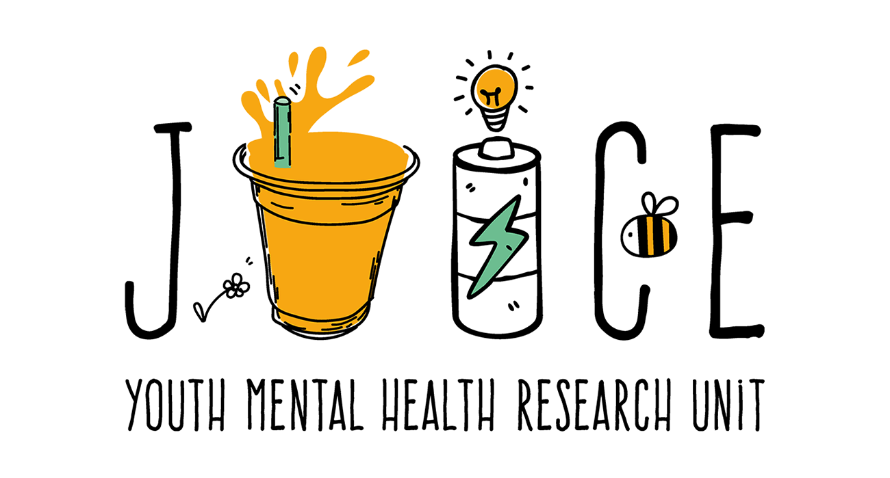
After being set up for over 18 months, our Youth Mental Health Research Unit finally has a new name and a logo! We hope you like it as much as we do. You might be wondering how ‘JUICE’ relates to the Research we do and our focus on young people’s mental health. This is the story behind it and how we developed the logo.
Who was involved?
Who best to ask to help us design our name and logo than young people themselves?

We have been set up by Greater Manchester Mental Health NHS Foundation Trust, so it was crucial to us that we involved young people from these services to work with us on this project.
We were lucky enough to speak with people at Junction 17 Inpatient Unit who agreed to help us out.
The PPI Group became our branding consultants on the project and were paid for their time. We also enlisted a fantastic graphic designer called Astrid to help us with the process and do all the design and art work technical bits.
- Our work is for young people, and has young people at the heart of it, so that was a priority!
- We wanted it to be designed by people who would be using our research unit and who we want to help with our work.
- With creating the ‘JUICE’ brand we wanted to attract the interest of young people and make sure that they know that the research unit is about them. We didn’t want the logo and brand to be too childish, but we did want it to be engaging to young people to appeal to those we are working with.
- Finally – we wanted to be creative to explore the true heart of our work as the full title ‘Youth Mental Health Research Unit’ we had for the first 18 months is a bit of a mouthful.
What did we do?
Initially we took all the information about us as a unit; our values, our research and what we want to achieve with our work.
This includes things like making sure young people are involved in the work that we do, and giving people control over the research that is being done. Astrid came to meet with a group of young people to chat over the basics of graphic design and to develop some ideas.
After working hard to give us some thoughts about the design they told us that they would prefer to do things a bit more informally, so we changed things up. We came back another time to sit together with more young people on the unit, who contributed loads of ideas and scribbles.
We took all of this to Astrid who created some draft logos to bring back to the unit. After many tweaks (e.g. addition of the bee) and versions we finally managed to get the seal of approval from our consultants!
So why ‘JUICE’?
As much as we would like this to be really clever, the initial idea was quite random! Many of the people we spoke to said it would be better to have a name which was unrelated to mental health.
Having something that couldn’t be made offensive or stigmatising was really important. For example, one person said, “Imagine someone saying to you ‘Oh, you’re so juice!’ – yeah not very offensive mate!” After sharing lots of the things we were passionate about it also became clear that this random word of juice could actually represent lots of the things we stand for.
Juice is often seen as a healthy option, sometimes being associated with fresh, vibrant fruit and vegetables. This links in with our physical health work on Y-Health and Motiv8, looking after your body and your mind!
The Psychological Trials we have worked on to offer services to young people as early as possible when they’re asking for help and work on ‘recovery’ – whatever this means to you. We also had discussions about juice being linked to power e.g. ‘when your phone runs out of juice…’ and how we are working to empower young people to have a voice in the work we do.
JUICE was associated with words like health, energy, wellbeing, and youth. Suddenly it didn’t seem so random after all.
[It also fits nicely with our motto ‘Jointly United In Search of Clinical Excellence’! But is a bit more exciting.]
What do all of the elements represent?
Lots of the features were added by our consultants. This included a juice-cup forming the letter ‘U’ to make it stand out.
Having a battery power bank as the letter ‘I’. The bee was added (of course a symbol known to represent Manchester) to show where the unit is based and where it came from although we work with people all over the world, and a flower to symbolise growth.
Having gender neutral colours was also important, as well as choosing vibrant and contemporary colours, to make the logo stand out!
Thank You!
Thank you so much to all the different young people who were involved with this and helped us from the start.
Thank you also to Astrid for being very accommodating with amendments as we took it back and forth to our consultants at Junction 17!
We would love to hear from you if you have any thoughts about what our logo means to you and of course if you’d like to work with us in the future, please do get in touch.
Contact: ymhru@gmmh.nhs.uk
